Data Types in Statistics: Building the Foundation for Accurate Analysis

Have you ever tried to guess how well off someone is, how he or she scored on a test, or what a survey referred to, when somebody wrote sometimes? If that is the case, you have already been forced to contend with the bewildered state of data types in statistics, whether you Correctly understanding types of data in statistics helps avoid misinterpretation and makes sure that your analysis is a reflection of reality. Understanding the types of statistical data is crucial for researchers and analysts to choose the right analysis methods and ensure accurate results.
Imagine that you are the manager of a cafe. There are days when you note the number of cappuccino you sold, some days you note the happiness of customers on the scale of 1 to 5 and some days you simply write that a customer liked tea better than coffee. All these observations are data but they are the various types of statistical data. It is too easy to have the false conception of the results unless you identify the difference. You might assume that customer feedback was correct figures or do the wrong method to calculate sales.
Here the data types of statistics come in. These are the essential components of any useful analysis. An architect cannot build without knowing of which material (brick, steel, or wood) he is dealing with. On the same note, a data analyst cannot make rightful conclusions unless he/she is aware of the type of data he/she is dealing with.
What is Data?
Data refers to a set of facts, statistics, observations or measurements that could be examined in order to discover patterns or trends. It may be figures, words, signs or even images. The knowledge of types of data in statistics is very crucial since it defines how this information will be organized, analyzed, and interpreted. Statistics consists of data and statistics are made of wheat like bread. In its absence no useful analysis can be made.
An example would be the test scores of students which can be the sales the business makes or the reviews of a product by customers into the right group of statistics data types to give valuable information.
Why Understanding Data Types Matters
Before launching into categories, it is worth answering the larger question: Why are you interested in data types in statistics?
- The reason is they determine the statistical test or visualization that you will use.
- Since they eliminate errors, such as attempting to compute some sort of average when something can not be numerically defined (e.g., average of eye colors).
- Since they enhance decision-making, the results are more reliable and familiar in the real world.
Issue: It is a common error of many novices in statistics (and even professionals) to assume that all data are represented as numbers. The consequence of this is the application of incorrect formulas, graphs and misleading results. The first step to the proper analysis is the identification of statistical data types.
Solution: Begin all analyses with determining the type of data. It is the initial gateway before proceeding to statistical tools.
Understanding data types is the foundation of effective research, but accurate insights require the right statistical methods. Our experts provide professional statistical data analysis services using SPSS, AMOS, R, Stata, regression analysis, hypothesis testing, and SEM to help researchers, students, and businesses make data-driven decisions.
Raw Data vs. Processed Data
1. Raw Data
The raw, unstructured data which is directly obtained by the sources.
Example: Survey replies in other forms, such as twenty-five, 25, or twenty-five years.
Issue: difficult to read and to analyze unless divided into categories of statistical data.
2. Processed Data
Information that has been transformed, organized and put into sensible use.
Example: Turning all survey data into a standard numeric data (e.g., 25 years).
Pro: Assists in making patterns, trends and other valuable information, makes sure that the right types of statistical data are used properly.
Quick Hack: Raw data can be treated as raw vegetables and processed data as a well-cooked meal. They are both useful, and one of them is already prepared to eat.
How is raw data processed?
Marketers should process raw data on a number of basic steps to extract actionable insights:

- Data collection: The collection of the appropriate data using diverse sources, including the interaction with the user, records of transactions, and social media.
- Data cleaning: Elimination of errors, duplicates and inconsistencies to achieve the data quality.
- Data transformation: The conversion of raw data into a form that is easily analyzed, usually through normalization and aggregation.
- Data analysis: Use of statistical techniques and programs, e.g., SQL or data visualization systems, to analyze the processed data and identify significant patterns and identify types of data.
- Data visualization: To present the analysis findings in a clearer and easier to understand or decision-making framework, the data will be presented in the form of charts and graphs for each type of statistical data.
- Generation of insights: This involves drawing practical suggestions out of the analysis in order to guide the marketing strategies.
Significance of Data in Statistics.
Why is data so important?The science of learning through data is statistics. Lack of it will mean that decision-making is being made on a whim or a hunch.
- Analysis Foundation Each statistical method, including averages, regression, etc., begins with data.
- Determines Trends Data shows customer trends, market trends and social trends.
- Makes Projections into the future – Previous information can be used to project future performance.
- Supports Objectivity It uses data to eliminate bias, which makes choices more evidence-based.
Even the most excellent tools can give misleading results, unless there is the relevant identification of types of data in statistics.
Broad Classification of Data
At its core, statistical data is broadly classified into two types:
- Qualitative (Categorical) Data – describes qualities, labels, or characteristics.
Example: Gender, colors, brand names. - Quantitative (Numerical) Data – represents numbers that can be counted or measured.
Example: Age, salary, weight.
Consider it in the following way: qualitative data explains the what and quantitative data explains the how much.The correct identification of the types of data in statistics can guarantee the correct analysis of the statistical data types.
| Basis of Difference | Qualitative (Categorical) Data | Quantitative (Numerical) Data |
| Definition | Describes attributes, categories, or characteristics | Represents numbers that can be counted or measured |
| Nature | Non-numerical | Numerical |
| Types | Nominal, Ordinal | Discrete, Continuous |
| Examples | Gender, eye color, nationality, brand preference | Age, height, weight, salary, number of books |
| Purpose | Identifies “what kind” or “which category” | Identifies “how much” or “how many” |
| Statistical Analysis | Uses mode, percentages, chi-square tests | Uses mean, median, standard deviation, t-test, ANOVA |
| Graphical Representation | Bar charts, pie charts | Histograms, line graphs, scatter plots |
| Precision | Less precise (descriptive in nature) | More precise (measurable with accuracy) |
Quantitative Data: Discrete vs. Continuous
Quantitative data, which is about numbers, is split into two groups: discrete data and continuous data. Knowing the distinction is important because it changes how we gather, show, and look at data in statistics.
1. Discrete Data
Discrete data is made up of values that can be counted and are limited. Most of the time, they stand for entire numbers, not fractions or decimals.
- Common Mistake: Many people assume discrete data can be continuous—for example, thinking of “number of children” as something that could have decimals, which is not possible.
- Solution: Always remember that discrete data can only take specific integer values.
2. Continuous Data
Continuous data is data that may take any value within a certain range and can be measured with great accuracy.
- Common Mistake: People often round off continuous data too much, which may distort results and hide variations.
- Solution: Maintain necessary decimal precision and use suitable graphs (like histograms, line graphs) to represent continuous data effectively.
Using the correct types of data in statistics ensures proper representation.
| Feature / Aspect | Discrete Data | Continuous Data |
| Definition | Data that can take only specific, countable values | Data that can take any value within a range |
| Nature | Separate and distinct values | Infinite possible values within a range |
| Values | Whole numbers only (no decimals/fractions) | Includes fractions and decimals |
| Examples | Number of cars, number of students, number of phone calls | Height, weight, time, temperature, speed |
| Measurement Method | Counting | Measuring |
| Possible Outcomes | Finite (limited set of values) | Infinite (theoretically unlimited possible values) |
| Graphical Representation | Bar graphs, frequency tables | Histograms, frequency polygons, line graphs |
| Problem | Misinterpreted as continuous data | Oversimplified by excessive rounding |
| Solution | Remember: only integers are valid | Preserve decimals when required for accuracy |
Levels of Measurement (Scales of Data)
When working with ratio or interval scales, knowing which measure of central tendency to use—mean, median, or mode—can greatly influence your interpretation.
Why it matters
Your scale dictates which summaries, charts, and statistical tests are valid. Get the scale wrong → get the conclusions wrong.
1. Nominal Scale – “Names only”
Under the nominal scale scale there are no intrinsic order of labels and groups. The names of cities, blood type, or product groupings are some examples. Equality or difference but not ranking can only be checked. This type of data can be summarized by means of mode and percentages. Pie charts and bar charts are useful. Statistical methods such as chi-square are commonly applied by people.
2. Ordinal Scale – “Ranked, but gaps unknown”
The ordinal scale organizes data and ranks them, but it does not indicate the extent to which the rankings are dissimilar. The most obvious ones are the educational levels or the levels of satisfaction. Gaps cannot be counted, and analysts can look at orders. As a summary, use medians and percentiles. Ordered bar charts are the best and non-parametric testing ensure that the analysis is correct.
3. Interval Scale – “Equal steps, no true zero”
The interval scale uses the number that are spaced evenly but the number 0 is arbitrary and does not imply absence. As a case in point, Celsius temperature and calendar years. Ratios are not available to analysts, whereas differences can be found. This type of data can be characterised by mean, variance and standard deviation. There are good ways of showing data on line charts, histograms, and density plots.
4. Ratio Scale – “Equal steps, real zero”
The ratio scale has real zero numbers, and this implies that there is no data at all. The age, weight, distance and income are some of the examples. All arithmetic, ratios, percentages, are accurate. Summarising data can be done using the mean, geometric mean and coefficient of variance. Patterns could be well illustrated using histograms, scatterplots, and boxplots, and are useful in more sophisticated parametric analysis.
The appropriate choice of the scale guarantees valid summaries, graphs, and statistical tests. Knowledge of the data types in statistics is imperative in the proper interpretation of the statistical data types.
| Scale | Meaning | Can rank? | “Twice as much”? | Typical summaries | Typical visuals | Typical tests (examples) |
| Nominal | Labels/categories | No | No | Mode, counts, percentages | Bar, pie | Chi-square, Fisher’s exact |
| Ordinal | Ordered categories | Yes | No | Median, percentiles, mode | Ordered bars, stacked bars | Mann–Whitney, Wilcoxon, Kruskal–Wallis |
| Interval | Equal intervals, no true zero | Yes | No | Mean, SD, variance | Histogram, line | t-test, ANOVA, Pearson r, regression |
| Ratio | Equal intervals, true zero | Yes | Yes | Mean, median, geom. mean, CV | Histogram, boxplot, scatter, line | All above; ratio-based analyses valid |
Cross-sectional and time-series data: Cross-sectional data refers to a set of measurements at a given point in time that indicates how various individuals, groups of people, or organisations are performing regarding various aspects. As an example, when we consider the income of families in 2025, we get cross-sectional information. Conversely, time-series data consists of observations that are recorded routinely. This allows you to analyze trends, patterns and predictions, e.g. the monthly rate of inflation or the price of stocks. The for comparison of groups cross-sectional data is excellent but the time series data is also essential to determine what has changed and what will occur in the future.
Both of them must be properly placed in the data type categories in statistics to reach substantial conclusions.

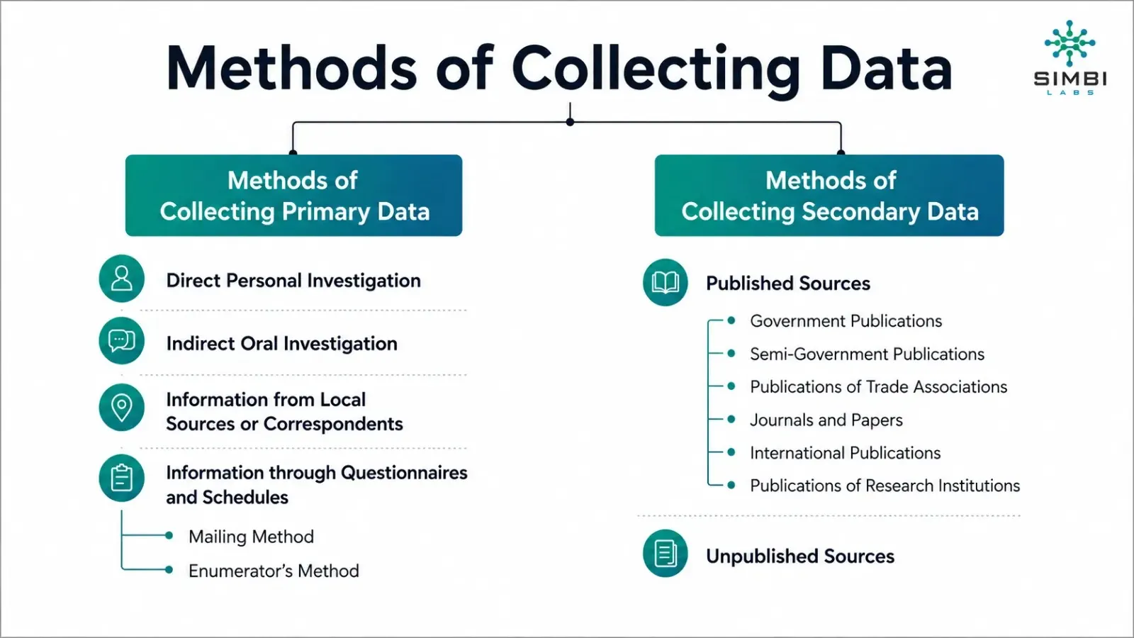
Primary vs. Secondary Data: This is because primary data are collected by the researcher himself through the use of surveys, experiments, interviews or observations and tailored to meet specific study needs. It is also accurate and relevant but can be costly and time-consuming, which are its main strengths. Secondary data, in its turn, is the information that has already been collected and published by other individuals. Some such examples are government reports, corporate records and web databases. It is inexpensive and accessible readily but it might not be precise enough to meet some research requirements. What you are willing to do, the amount of money you have, and the amount of data you have will assist you in making a decision as to which one to use.
The selection of the correct source influences the types of statistical data that can be put into practice.
Structured and Unstructured Data Structured data is highly organised, and it is stored in rows and columns and can be easily analysed with standard database or statistical tools. Examples of these include sales statistics, employment and financial transactions. Unstructured data, conversely, does not possess a prescribed format and can take an immensely wide variety of forms, including text, photos, videos, social media posts, and consumer feedback. Structured data is more convenient to deal with, whereas the unstructured data provide us with much information concerning the way people think and behave. It is becoming more and more useful that unstructured data, when it is better at machine learning and natural language processing, can be used to corporate intelligence and decision-making.

The Use of Data Type in Business.
Knowledge of types of data is essential to a business since it dictates what type of analysis should be used, and what conclusions can be made. Most organizations resort to the services of professionals such as Simbi Labs of India who specialize in statistical analysis in order to get the accuracy and clarity of business insights.
1. Better Decision-Making
The data used by businesses is very varied and each has its purpose in analysis. The figures of sales can be considered in the form of ratio data, which can be measured and compared with much precision. Customer satisfaction surveys tend to produce ordinal data, meaning that the answers are ranked, but not in absolute values. Product-categories on the other hand, are categorized under nominal data because they merely group the items without any rank or size.
It is critical to identify these various types of data of statistics since this guarantees that appropriate statistical measures are used during analysis. Applying the appropriate technique to different types of data does not only enhance the precision of findings but also gives valuable information that can be reliable in making strategic decisions. This cautious differentiation assists companies to transform unprocessed information into viable measures that promote growth and productivity.
2. Efficient Data Collection & Organization
The understanding of data being one of discrete, continuous, nominal, or ordinal is useful in making effective surveys, databases and dashboards. Once the appropriate kind of data used in statistics is located, then the businesses can organize their data-gathering process to make it accurate and understandable.
To illustrate this, an age of customers is ratio data that can be stored as a number in order to perform accurate analysis and preferences are nominal data that can be classified in order to be grouped easily. This renders the data more useful in its application in decision-making.
3. Accurate Market Analysis
Ratio data is used to measure changes in business growth, to monitor earnings, and to determine the level of return on investment precisely as sales and revenue are examples of ratio data. The ratio data because it has a true zero and can be operated upon mathematically can be used to make a more detailed analysis of the financial data and its comparison over time. These facts can be a good basis to evaluate the overall performance, profitable spheres, as well as to take an informed investment decision based on data.
Data of ordinal type, such as rating and rankings, identifies the preferences and level of satisfaction among customers in a systematic manner. Although it does not quantify the actual difference between responses, it reveals definite trends in the perception of the customers towards products or services. Such information can be useful in comprehending the things that are most treasured by customers, reveal areas where the service is performing poorly and those that must be strengthened in order to improve the overall satisfaction.
Time and temperature are examples of interval data that can be used to aid the operational planning because the data contains regular intervals between the values though there is no absolute zero. Such data is especially applicable to such industries as manufacturing, logistics, and hospitality as well where the environmental conditions and time schedule directly influence the efficiency. By monitoring these values, the business is able to control processes in a better manner, allocate resources in the best way possible and minimize operational risks.
4. Choosing the Right Visualization & Tools
In choosing how to illustrate your ratio or categorical data, you can refer to the visual representation of statistical data, which can help to better understand and act on insights.
The bar charts are very useful when dealing with nominal data as one can easily compare ones categories with another. In the same way, histograms are most appropriate to continuous data because they show the value distribution within a range whereas scatter plot is most adequate to ratio data because it shows the relationship between variables. Choosing the appropriate visualization tool to be applied to each type of data, businesses will be able to analyze the information more accurately, and reveal the patterns that will not be observed in the numbers.
Beyond assisting in analysis, appropriate visualization simplifies the process of communicating findings with a stakeholder. Very clear and organized charts help simplify the complex datasets where decision-makers are able to process and understand the information and take action on it. This means that the data-driven strategies are not only precise but also easily interpreted by team members in different teams.
5. Risk Management & Forecasting
The correct type of data will make statisticalizing and prediction accurate and reliable. Once the data is matched with the appropriate analytical techniques, forecasts get more accurate, and enterprises will be able to reduce uncertainty in planning and operations.
An example will be time-series ratio information like sales revenue where future demand estimation and growth trends can be determined. Simultaneously, categorical data is useful to divide risks and perceive their possible effect. All these methods allow a balanced approach to forecasting and also reinforce the risk management strategies.
6. Improving Customer Experience
Ordinal data that come out of surveys like levels of customer satisfaction give good information on the quality of services. It is important because businesses can use this information to recognize the areas of strengths, weaknesses and make improvements that directly add to customer experiences.
Organisations can use nominal data to create customized marketing campaigns, e.g. gender, location, and interests. When companies make services and communication tailored to the particular customers, they will be able to engage more customers, enhance loyalty, and establish long-lasting relationships with customers.
Real-Life Applications of Data Types
- Healthcare: Physicians use categorical data (such as blood type), as well as numerical data (such as blood pressure) to determine what is ailing a patient.
- Companies: Use ordinal data (satisfaction levels) and discrete data (frequency of consumer purchase) to subdivide their customers into groups.
- Education: Test scores represent an instance of continuous data, whereas grades represent an instance of ordinal data.
- Business: Sales teams work with ratio information (revenue) to work, and the HR works with nominal information (departments).
- Government: Census information assists in determining policies, budgets and social programs to be implemented.
Decisions made without data are made on assumptions and those made with data made on evidence. The analysis of this data using research partners like Simbi Labs of India is usually conducted by the company with the help of which it transforms the data into effective strategies that can be implemented.
Interesting Fact
Did you know? The concept of levels of measurement was developed by psychologist Stanley Smith Stevens in 1946 and it has become an important component of modern statistics.
Question for Readers
Whenever you encounter a survey or dataset, be able to ask yourself: What kind of data is this? Then you will find we misclassify it so often!
Conclusion
It is not sufficient to merely study the definitions of statistics data types. You must also know how to use them properly, concisely and make better decisions. How to view information types ensures that you can obtain reliable information, be it running a cafe or a multinational corporation correctly categorizing the types of statistical information and types of data in statistics is the basis of an efficient analysis.
The thing is simple: before you start doing maths, you should know your facts. The distinction between making a practical decision and telling the wrong story is one thing. The second advice is when you come back to data, ask yourself, am I handling this data in the appropriate manner? In statistics, it is not just that the first step is to understand what type of data you have but it is the fundamental overall level.
You are willing to have your data and make decisions? Contact Simbi Labs immediately and begin your adventure with a sense of confidence. You should not rely on statistics to interfere with your study or PhD work, especially in case you are experiencing problems with your data. Allow our team of experts to handle the same.
Book a free consultation for appointment
Email us at : grow@simbi.in
Our New Book Launch
For an in-depth understanding, please refer to our book, “Academic Research Fundamentals: Research Writing and Data Analysis”. It is available as an eBook here, or you may purchase the hardcopy here .