
Interpreting SPSS Output Tables for Research Papers: A Complete Guide with Examples
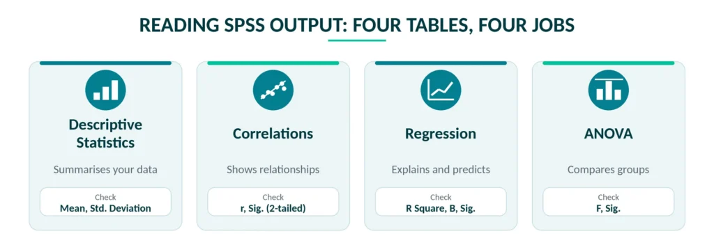
You run the test in SPSS, the Output window fills up with tables, and now you have to turn all of it into two clean paragraphs for your thesis or journal paper. This is where most researchers get stuck. The numbers are right there on the screen, but nobody told you which ones matter and which ones you can ignore.
This guide shows how to interpret SPSS output one table at a time. We use a small example dataset, show the tables the way SPSS prints them, and explain each one in plain language. By the end you will know how to interpret SPSS results for descriptives, correlation, regression and ANOVA, and how to write them up in your research paper instead of pasting the output and hoping for the best.
READ MORE: Ultimate Trusted SPSS Data Analysis for Thesis Guide
The Example Dataset Used in This Guide
Every table below comes from one example dataset of 120 undergraduate students. It is made-up data, created only to show what SPSS output looks like and how to read it, so please don’t quote these numbers as real findings. The variables are:
- Exam_Score: final exam marks out of 100
- Study_Hours: hours of study per week
- Attendance: percentage of classes attended
- Motivation: average score on a 1 to 5 motivation scale
- Method: teaching method (Lecture, Blended or Online, 40 students in each group)
The research question is simple: what helps students score better in the exam? We will answer it with descriptives, a correlation table, a regression and a one-way ANOVA.
Reading the Output Window Before You Read Any Table
After you run a test, SPSS may show a few extra items such as Notes and Active Dataset. You can skip those most of the time. Your work is in the tables with titles like Descriptive Statistics, Correlations, Model Summary, ANOVA and Coefficients. Each table answers a different question, so the order you read them in matters. This is the order we follow:
- Check the sample size (N) first. If it is lower than you expected, SPSS has dropped cases with missing values.
- Read the descriptive statistics. Mean, standard deviation, minimum and maximum tell you whether the data looks sensible.
- Check the assumptions your test needs, for example Levene’s test for ANOVA or VIF for regression.
- Open the main table for your test and read the Sig. value before anything else.
- Look at the size of the effect (r, R Square, Beta or eta squared), not only the p-value.
- Link the result back to your hypothesis and say it in plain words.
Descriptive Statistics Table
Start here, because this table tells you whether your data is even usable. In SPSS you get it from Analyze > Descriptive Statistics > Descriptives.
Descriptive Statistics
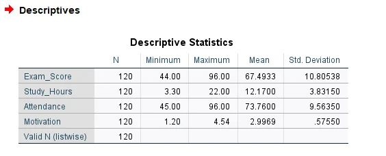
Here is how to read it. The N column shows how many cases were used for each variable, and Valid N (listwise) shows how many cases have complete data on every variable at once. Both are 120, so nothing was lost to missing values.
Next, check the Minimum and Maximum for anything that looks impossible. Motivation runs from 1.20 to 4.54 on a 1 to 5 scale, which is fine. If you saw a 7 there, you would know a typing mistake got into the data file. Attendance goes from 45 to 96 percent, which is believable.
The mean tells you the typical value and the standard deviation tells you how spread out students are around it. The average exam score is 67.49 with a standard deviation of 10.81, so most students scored somewhere between about 57 and 78 marks (the mean plus and minus one standard deviation). In your paper, you could write: “The 120 students scored 67.49 marks on average (SD = 10.81) and studied 12.17 hours per week (SD = 3.83).”
READ MORE: Descriptive vs Inferential Statistics
Correlation Table in SPSS
This section is about how to interpret correlation table in SPSS. You get the table from Analyze > Correlate > Bivariate with Pearson ticked. It looks big, but it repeats itself, so it is easier than it seems.
Correlations
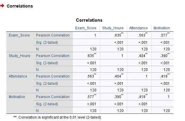
Every variable gets three rows: Pearson Correlation (the r value), Sig. (2-tailed) and N. The 1 on the diagonal just means a variable correlates perfectly with itself. The table is also a mirror image, so the numbers above the diagonal are the same as the numbers below it. Read one side only.
Take the first pair. Exam_Score and Study_Hours have r = .635 with Sig. = .000 and N = 120. The sign is positive, so students who study more hours tend to score higher. The size is above .50, which counts as a strong relationship. The two asterisks next to .635 tell you it is significant at the .01 level. SPSS prints .000 when the p-value is smaller than .0005, so in your paper write p < .001 and never p = .000.
A quick trick for explaining strength: square the r value. Here .635 squared is about .40, so study hours and exam scores share roughly 40 percent of their variation. Attendance (r = .563) and Motivation (r = .577) are also strong with Exam_Score. The three predictors correlate with each other too, between .390 and .418. That is moderate, and it is worth noticing because it comes back in the regression.
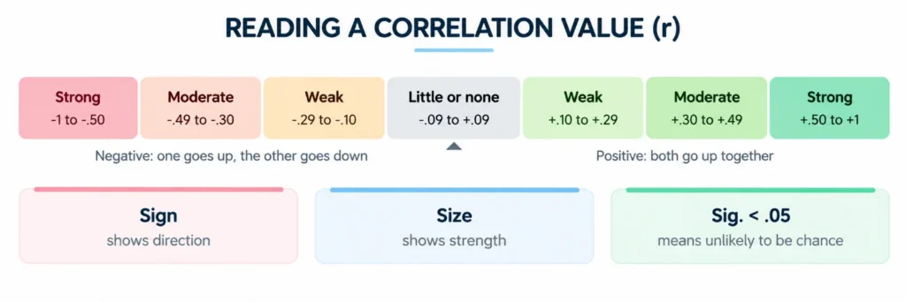
Two cautions. First, correlation does not prove cause. A high r says two things move together, not that one makes the other happen. Second, Pearson’s r suits continuous variables with a roughly straight-line relationship. For ordinal data or badly skewed data, use Spearman’s correlation instead.
Analysing Regression Results in SPSS
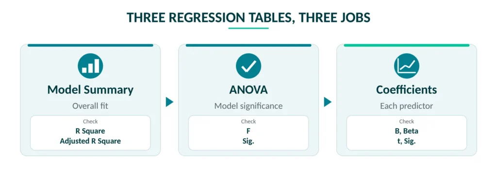
Correlation tells you that things are related. Regression goes one step further and tells you how much each variable adds when the others are held constant. To understand how to analyse regression results in SPSS, think of the output as three tables you read in order: Model Summary, ANOVA and Coefficients. In our example, Exam_Score is predicted from Study_Hours, Attendance and Motivation. The path is Analyze > Regression > Linear.
Model Summary Table
Model Summary
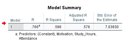
R is the combined correlation between the predictors and the outcome (.766). R Square is the one you will quote: .586 means the three predictors together explain about 58.6 percent of the differences in exam scores. Adjusted R Square (.576) trims that figure a little for the number of predictors you used, so prefer it when your model has several predictors. The Std. Error of the Estimate (7.038) says your predictions are typically off by about 7 marks. A Durbin-Watson value near 2 (2.330 here) suggests the residuals are independent. Values between about 1.5 and 2.5 are normally fine.
ANOVA Table in Regression
ANOVA
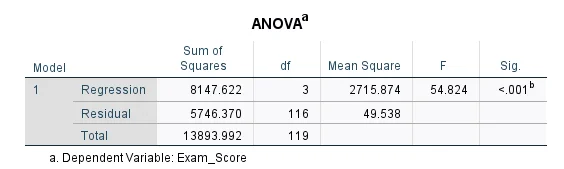
Don’t let the name confuse you. This ANOVA is not comparing groups. It tests whether the model as a whole predicts exam scores better than simply guessing the average for everyone. The answer sits in the F and Sig. columns: F = 54.824 with Sig. = .000, so the model is significant overall (p < .001). The degrees of freedom are 3 for the regression (three predictors) and 116 for the residual (120 cases minus 3 predictors minus 1), which you report as F(3, 116).
Coefficients Table
Coefficients
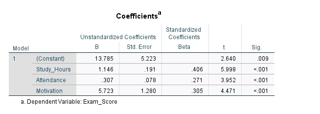
This table shows the effect of each predictor. Study_Hours, Attendance, and Motivation are significant predictors (Sig. = .000). The B values show that each additional study hour predicts 1.146 more marks, each 1% increase in attendance predicts .307 more marks, and each one-point increase in motivation predicts 5.724 more marks, holding other variables constant. Based on Beta, Study_Hours is the strongest predictor (.406), followed by Motivation (.305) and Attendance (.271). VIF values around 1.3 indicate no multicollinearity problem. The regression equation is Exam_Score = 13.785 + 1.146(Study_Hours) + .307(Attendance) + 5.724(Motivation), predicting about 67.69 marks for 12 study hours, 75% attendance, and motivation of 3.0.
One-Way ANOVA Table for Comparing Groups
Use one-way ANOVA when you want to compare the means of three or more groups. Here we compare exam scores across the three teaching methods. The path is Analyze > Compare Means > One-Way ANOVA, and it helps to tick the homogeneity of variance test and a post hoc test such as Tukey.
ANOVA (Exam_Score)
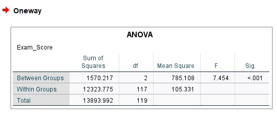
Read the F and Sig. columns first. F = 7.454 with Sig. = .001, so at least one teaching method has a different average score from the others (p = .001). Before trusting that, check Levene’s test in the homogeneity table. Its Sig. here is .585, which is above .05, so the equal-variance assumption holds. To judge the size of the difference, divide the Between Groups sum of squares by the Total: 1570.217 / 13893.992 = .113. This is eta squared, and it means teaching method explains about 11 percent of the variation in scores, a medium-to-large effect.
Post Hoc Test with Tukey
A significant ANOVA does not tell you which groups differ. That is the job of the Multiple Comparisons table. The group means are Lecture 65.18, Blended 72.60 and Online 64.70.
Multiple Comparisons (Tukey HSD)
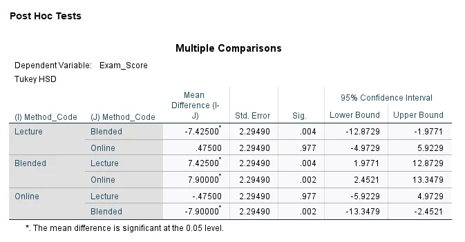
Look at the Sig. column again. Blended is significantly different from Lecture (Sig. = .004) and from Online (Sig. = .002). Lecture and Online are not different from each other (Sig. = .977). So the story for your paper is that the blended method scored about 7 to 8 marks higher than the other two, while lecture and online performed about the same.
P-Values and Significance in Plain Words
The Sig. column shows up in every table above, so it is worth getting it straight. The Sig. value is the chance of seeing a result at least this strong if there were really no effect in the population. A small value means the result is unlikely to be luck.
- A value below .05 is the usual cut-off for calling a result significant, but it is a convention, not a law of nature.
- SPSS shows .000 for very small values. Report it as p < .001.
- Significant does not mean important. With a large sample, tiny differences become significant, so always report an effect size such as r, R Square or eta squared.
- Not significant does not mean no effect. A small sample may simply be too small to detect it.
Explaining SPSS Results in Your Research Paper
Pasting the output into your chapter is not explaining it. Examiners and reviewers want the key numbers in the right format and a plain sentence on what they mean. Here is a simple pattern for how to explain SPSS results in any chapter:
- Name the test and say why you used it, for example “A multiple linear regression was run to see whether study hours, attendance and motivation predict exam score.”
- Report the key statistics in APA style, such as F(3, 116) = 54.82, p < .001, with R squared and the Beta values.
- Say what the numbers mean in everyday words, for example “students who studied more tended to score higher.”
- Connect the result to your hypothesis and state whether it was supported.
- Mention limits, such as sample size, the type of sample and the assumptions you checked.
Sample Results Paragraph for the Regression
A multiple linear regression was calculated to predict exam score from weekly study hours, attendance and motivation. The model was significant, F(3, 116) = 54.82, p < .001, and explained about 59 percent of the variance in exam scores (R squared = .586, adjusted R squared = .576). Study hours (β = .41, p < .001), motivation (β = .30, p < .001) and attendance (β = .27, p < .001) were all significant predictors. Each additional hour of weekly study was linked with 1.15 more marks when the other variables were held constant. The hypothesis that study habits and engagement predict exam performance was therefore supported.
Sample Sentence for the Correlation
Exam score was strongly and positively correlated with weekly study hours, r(118) = .63, p < .001, meaning that students who studied more tended to score higher.
Don’t paste raw SPSS screenshots into the paper. Rebuild the tables in a clean format and keep only the ones that answer your hypotheses.
Common Mistakes in Reading SPSS Output
- Writing p = .000 instead of p < .001.
- Looking only at Sig. and ignoring effect sizes like R Square, r or eta squared.
- Ranking predictors by B instead of Beta.
- Forgetting that the ANOVA table inside a regression tests the whole model, not a group comparison.
- Skipping assumption checks such as normality, linearity, equal variances, multicollinearity and independence of residuals.
- Treating a correlation as proof that one variable causes the other.
- Reporting every table in the paper instead of the ones linked to the hypotheses.
- Rounding too early, which leaves your numbers slightly off from the output.
Support from Simbi Labs for SPSS Analysis and Interpretation
If you are short on time or unsure about a result, the Simbi Labs team can help at every stage. That includes cleaning and coding your data, running the right test in IBM SPSS Statistics, checking assumptions, interpreting every output table against your hypotheses and writing the results section so it reads clearly. Final reports can also be checked for plagiarism and AI-generated content.
- Statistical expertise across SPSS, biostatistics and SPSS AMOS
- Interpretations that match your research objectives and hypotheses
- Support tailored to your thesis, dissertation or journal paper
- Help from data collection to a finished report
Conclusion
SPSS output looks heavy until you know where to look. Check N and the descriptives first, read the Sig. column, then look at the size of the effect. For correlation, read r and Sig. on one side of the diagonal. For regression, go from Model Summary to ANOVA to Coefficients. For ANOVA, use the post hoc table to see which groups differ. Then explain each result in plain words and tie it to your hypothesis. Do that consistently and your results chapter becomes clear, correct and much easier to defend.
Get Expert Help with SPSS Output Interpretation
Looking for help with SPSS output interpretation or SPSS research data analysis? The Simbi Labs team offers data collection, statistical analysis, AI and plagiarism solutions and market research within India. Contact us today for accurate, publication-ready results.
Book a free consultation: appointment
Email us at: grow@simbi.in