
Graphical Representation of Data in Statistics

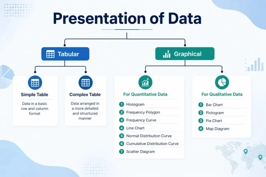
When data is king, statistics aren’t always enough. Readers might quickly become lost or overwhelmed by a page full of raw numbers. This is where graphs come in as the storytellers of numbers. Graphs Visual Representation Statistical Data transforms complicated statistics into clear, interesting pictures that show insights right away. Graphs help numbers speak louder than tables ever could. For example, a bar chart indicating sales growth, a histogram showing score distributions, or a pie chart demonstrating market share.
Read Also : How to Learn Statistical Data Analysis: Key Concepts and Practical Tips
Graphical Representation of Data in Statistics
Graphical representation is the process of presenting data visually using diagrams, charts, or plots. It helps to identify patterns, compare categories, and make complex information easily understandable.
Why Graphical Representation Matters
1. Simplifies large and complex datasets.
2. Makes trends, comparisons, and patterns visible instantly.
3. Helps decision-makers and learners interpret data quickly.
4. Creates engaging, memorable presentations.

Tables and charts for categorical data -Types of Graphical Representation of Data
Categorical data represent characteristics or labels such as gender, occupation, or product type. Since they are non-numerical, we use tables and charts to summarize and visualize them effectively.
Read More : Types of Data in Statistics: Examples and Classification
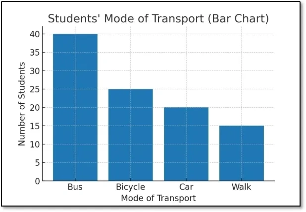
1. Bar Chart
Rectangular bars with equal width but varying lengths to show frequencies or counts.
i. When to Use: For categorical data (nominal/ordinal).
ii Example: Number of students preferring different modes of transport.
| Mode of Transport | Students |
| Bus | 40 |
| Bicycle | 25 |
| Car | 20 |
| Walk | 15 |
Steps
i. Open Excel and enter the dataset in two columns (A1:B5).
ii. Select the data range (A1:B5).
iii. Go to Insert → Charts → Column/Bar Chart → 2-D Column.
iv. Excel will insert a bar chart.
v. Add chart title: “Students’ Mode of Transport”.
vi. Format colors if needed.
Graph → Bars of different heights for Bus, Bicycle, Car, Walk.
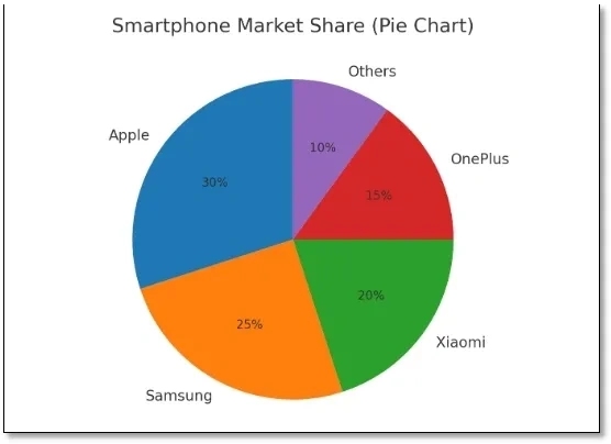
2. Pie Chart
A circular chart divided into slices, showing the proportion of each category.
When to Use: To show percentage or proportion of a whole.
Example: Market share of smartphone brands.
i. Apple: 30%
ii. Samsung: 25%
iii. Xiaomi: 20%
iv. OnePlus: 15%
v. Others: 10%
Steps
i. Enter data in Excel (A1:B6).
ii. Select the range (A1:B6).
iii. Go to Insert → Charts → Pie Chart → 2-D Pie.
iv. Right-click the chart → Add Data Labels to show percentages.
v. Add title: “Smartphone Market Share”.
Graph → Circle divided into proportional slices.
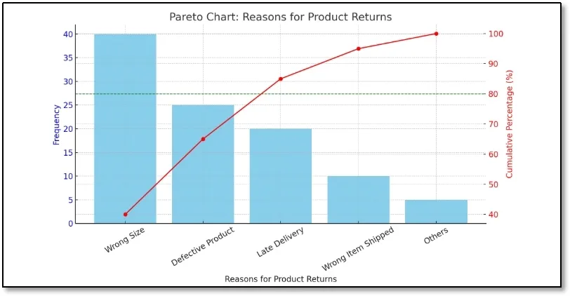
3. Pareto Chart
A Pareto Chart is a bar graph arranged in descending order of frequency, combined with a cumulative percentage line.
When to Use: It is based on the Pareto Principle (80/20 Rule), which states that roughly 80% of problems come from 20% of causes.
READ ALSO : Top Statistical Methods For Analyzing Data
Example– Reasons for Product Returns
| Reason | Frequency |
| Wrong Size | 40 |
| Defective Product | 25 |
| Late Delivery | 20 |
| Wrong Item Shipped | 10 |
| Others | 5 |
| Total | 100 |
Step 1: Order by Frequency (Descending)
| Reason | Frequency | Percentage | Cumulative % |
| Wrong Size | 40 | 40% | 40% |
| Defective Product | 25 | 25% | 65% |
| Late Delivery | 20 | 20% | 85% |
| Wrong Item Shipped | 10 | 10% | 95% |
| Others | 5 | 5% | 100% |
Tables and charts for numerical data
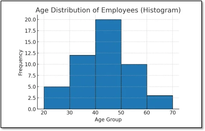
1. Histogram
A set of adjacent rectangles that represent the frequency distribution of continuous numerical data.
i. When to Use: For interval/ratio data divided into class intervals.
ii. Example: Distribution of ages in a company.
| Age Group | Frequency |
| 20–29 | 5 |
| 30–39 | 12 |
| 40–49 | 20 |
| 50–59 | 10 |
| 60–69 | 3 |
Steps
i. Enter dataset in two columns (A1:B6).
ii. Select the Frequency column (B2:B6).
iii. Go to Insert → Insert Statistic Chart → Histogram.
iv. If “Histogram” is not available: Use Column Chart and adjust bin labels.
v. Edit the horizontal axis to show Age Groups.
vi Add title: “Age Distribution of Employees”.
Graph → Bars without gaps, showing concentration of employees in age 40–49.
2. Frequency Polygon
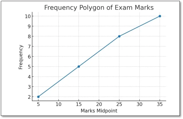
A line graph connecting the midpoints of histogram bars.
i. When to Use: To compare distributions or show trends smoothly.
ii. Example: Number of students scoring different ranges of marks in an exam.
| Marks Range | Frequency |
| 0–10 | 2 |
| 11–20 | 5 |
| 21–30 | 8 |
| 31–40 | 10 |
Steps
i. Enter dataset in two columns (A1:B5).
ii. Select the data range.
iii. Go to Insert → Charts → Line Chart with Markers.
iv. Excel will plot a line graph through the midpoints.
v. Add title: “Frequency Polygon of Exam Marks“.
Graph → Line connecting points (midpoints of each interval).
3. Line Graph
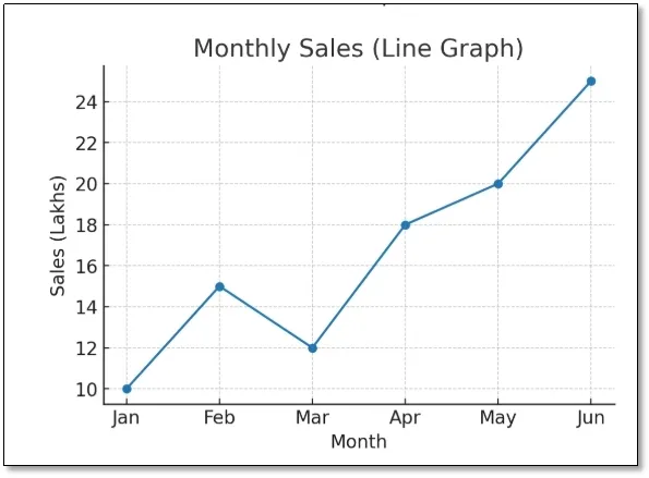
A graph that shows trends over time using points connected by lines.
i. When to Use: For time series data.
ii. Example: Company’s sales over 6 months.
| Month | Sales (₹ in Lakhs) |
| Jan | 10 |
| Feb | 15 |
| Mar | 12 |
| Apr | 18 |
| May | 20 |
| Jun | 25 |
Steps
i. Enter dataset in Excel (A1:B7).
ii. Select range (A1:B7).
iii. Go to Insert → Charts → Line Chart with Markers.
iv. Excel will plot sales trends.
v. Add chart title: “Monthly Sales Trend”.
Graph → Line trending upward, showing growth in sales.
4. Scatter Plot (Dot Diagram)
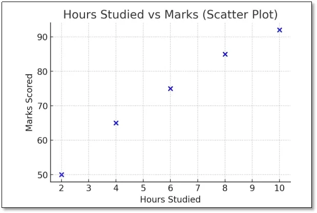
Dots on a coordinate plane representing the relationship between two variables.
i. When to Use: To check correlation between variables.
ii.Example: Relationship between hours studied and exam scores.
| Hours Studied | Marks Scored |
| 2 | 50 |
| 4 | 65 |
| 6 | 75 |
| 8 | 85 |
| 10 | 92 |
Steps
i. Enter dataset in Excel (A1:B6).
ii. Select the data range.
iii. Go to Insert → Charts → Scatter Plot (Dots only).
iv. The X-axis will be Hours Studied, Y-axis Marks.
v. Add title: “Hours Studied vs Marks”.
Graph → Dots sloping upward → positive correlation.
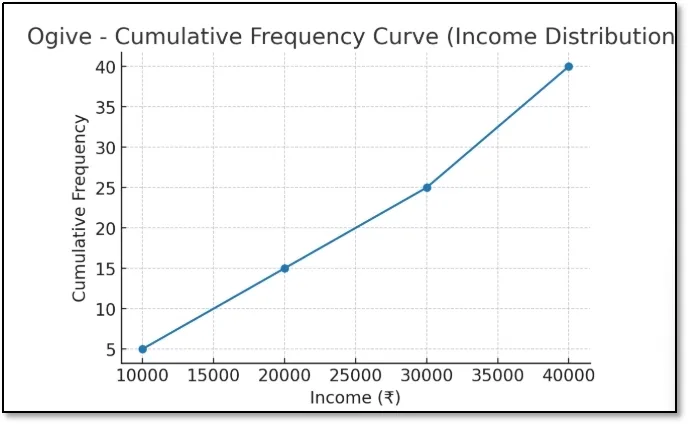
5. Ogive (Cumulative Frequency Curve)
A curve showing cumulative frequencies (less than or greater than type).
i. When to Use: To determine median, quartiles, or percentiles.
ii. Example: Cumulative number of households with income less than certain values.
| Income (₹) | Cumulative Frequency |
| <10,000 | 5 |
| <20,000 | 15 |
| <30,000 | 25 |
| <40,000 | 40 |
Steps
i. Enter dataset in Excel (A1:B5).
ii. Select data range.
iii. Go to Insert → Charts → Line Chart with Markers.
iv. Excel will plot the cumulative curve.
v. Add chart title: “Ogive – Income Distribution”.
Graph → Smooth increasing curve.
6.Stem-and-leaf plot
A stem-and-leaf plot is a method of organizing numerical data by splitting values into a “stem” (leading digit/s) and “leaf” (trailing digit).
When to use : When datasets are moderately sized, to quickly identify distribution, spread, and patterns while preserving individual data points. Ideal for test scores, survey data, and small statistics.
Example: Test Scores of 15 Students
Raw Data (Test Scores out of 100):
45, 56, 67, 72, 88, 90, 45, 53, 69, 74, 81, 67, 59, 63, 77
Step 1: Arrange Data in Ascending Order
45, 45, 53, 56, 59, 63, 67, 67, 69, 72, 74, 77, 81, 88, 90
Step 2: Create Stems (Tens Place)
4 → (40s)
5 → (50s)
6 → (60s)
7 → (70s)
8 → (80s)
9 → (90s)
Step 3: Add Leaves (Ones Place)
Stem-and-Leaf Plot
| Stem | Leaf |
| 4 | 5, 5 |
| 5 | 3, 6, 9 |
| 6 | 3, 7, 7, 9 |
| 7 | 2, 4, 7 |
| 8 | 1, 8 |
| 9 | 0 |
Interpretation
i. The lowest score is 45 (4 | 5).
ii. The highest score is 90 (9 | 0).
iii. Most students scored in the 60s and 70s range.
iv. A Stem-and-Leaf Plot is useful because it preserves the actual data values while showing the distribution like a histogram.
Read Also : Data Visualization That Works: Tables & Charts + Time Series Charts
Table of Graphical representation of data.
| Graph Type | Data Type | Example | Purpose |
| Bar Chart | Categorical | Transport choices | Comparison |
| Pie Chart | Categorical | Market share | Proportion |
| Histogram | Numerical (continuous) | Age distribution | Distribution shape |
| Frequency Polygon | Numerical (continuous) | Marks in exam | Compare distributions |
| Line Graph | Time series | Monthly sales | Trend over time |
| Scatter Plot | Numerical (paired) | Study hours vs. marks | Relationship |
| Ogive | Cumulative | Household income | Median, percentiles |
Common Mistakes to Avoid
1. Using pie charts with too many categories makes the chart cluttered and difficult to interpret accurately.
2. Choosing the wrong scale on the Y-axis can distort the data and mislead readers about the actual differences or trends.
3. Adding unnecessary 3D effects reduces readability and may create a misleading perception of the data.
4 Ignoring axis labels makes it difficult for readers to understand what the graph is measuring.
5. Using inconsistent colors can confuse the audience and make comparisons between data points less effective.
6. Not mentioning the data source reduces the credibility and reliability of the information presented.
7.Comparing unrelated datasets can lead to incorrect conclusions and misinterpretation of the statistical results.
Unlocking Insights with Statistical Graphs
The foundation of statistical data analysis is how data is organised and presented. Putting raw data into tables and graphs like bar charts, histograms, and stem-and-leaf plots not only makes it simpler to interpret, but it also shows patterns and connections that aren’t immediately apparent. Tables and charts are good for looking at categorical data, whereas ordered arrays and frequency distributions are good for looking at numerical data. Graphical tools make it easier to understand, which helps researchers, corporations, and students make smart choices.
Book a free consultation for appointment
Call Now : +91 99505 66669
Email : grow@simbi.in